
CSS Units Explained!
This guide will explain the most frequently used CSS units.


While learning CSS, we usually come across various CSS length units, and sometimes we might get confused as to when to use which particular unit. This article will help you concisely understand them.
Broadly, CSS units are classified into two categories - Absolute and Relative units.
Absolute Units and Relative Units
Absolute units are fixed in size. They are not affected by the screen size, their parent element, etc. Therefore, we don't use them when it comes to responsive design.
There are many absolute units such as cm, mm etc., but in this article, we'll only discuss px.
Relative units as the name suggests, are always relative to something. It can be relative to the parent element, the font size, the screen, etc. Relative units are always better when it comes to making responsive and accessible websites. The most commonly used relative units are %, vw, vh, rem, and em.
Prerequisites
This article assumes that you have a basic understanding of HTML5 and CSS3.
Now, let us understand them one by one, starting with px.
px
The absolute unit px is the simplest to understand. 1px = 1/96th of in.
It's relative to physical property and has nothing to do with the browser window or the parent element.
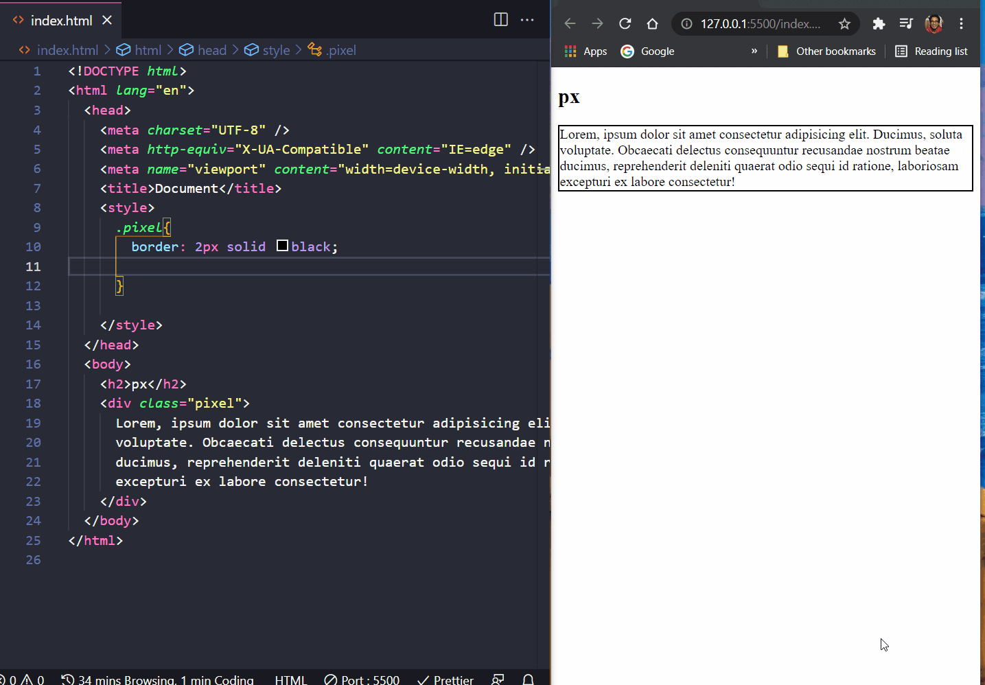
As we set width:200px, we set the div with class "pixel" at 200px in length, and upon moving the window, we see that the div element won't change its size as it's fixed, and therefore it's not affected by the size of the window, font size, parent element, etc.
We'll now discuss various relative units:
%
The % unit is relative to the parent element. So if we create a div element with width:50%, its width would be 50% of its parent element.
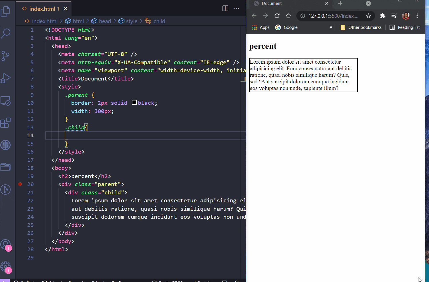
Let us have a parent container, inside which we have a child container. In the <style>, we set the width of div with class="parent" as 200px.
Next, we set the width of div with class="child" as 50%. Doing so, we see that child container takes up only 50% of the parent's size.
When we change the parent's width, the child's width also changes accordingly, but it will always take up 50% of the space.
% is also applicable on font-size.
vw
The vw unit is similar to %, but it completely ignores its parent size and depends on the screen's view width.

We keep the same setup from the % section, but instead of defining the width of the child in %, we define it using vw.
As you can see, vw doesn't depend on the parent's width and changes its width according to the browser's view width.
vh
The vh unit depends on the viewport height of the screen.

By setting height:30vh, we set the container's height as 30% of the viewport height of the screen. By increasing and decreasing the screen size, the container's height changes accordingly.
rem and em
Now rem is relative to the root element's font-size. Usually, the root's font-size in most browsers is 16px. So, 1rem will be 16px, 2rem would be 32px, 3rem would be 48px and so on.
We can check this by opening up the chrome dev tools as shown below.

rem is UX and accessibility friendly. Suppose a user has problems with eye-sight and has set his browser font size to "large", then our elements will adjust to the user preferences.
rem can be used to define the padding and margin of an element as well, and they will adjust according to the user's browser settings.
Now coming over to em unit.
The unit em works the same way as rem, but em is relative to its parent element's font size. There are some cases where em is useful but always using rem is preferred.
Let us look at some drawbacks of em by understanding what's happening in the gif:
- First we apply
font-size:1emtoulelements. Nothing happens. - When we change the font size from 1em to 2em, things go a little crazy.
- The first "em goes brrr" will have a font size of 32px as its parent is the root.
- Now, the second "em goes brrr" will have a font size of 64px as the parent font size in the first
ulis now32px. - Similarly, the third "em goes brrr" will have a font size of 128px.
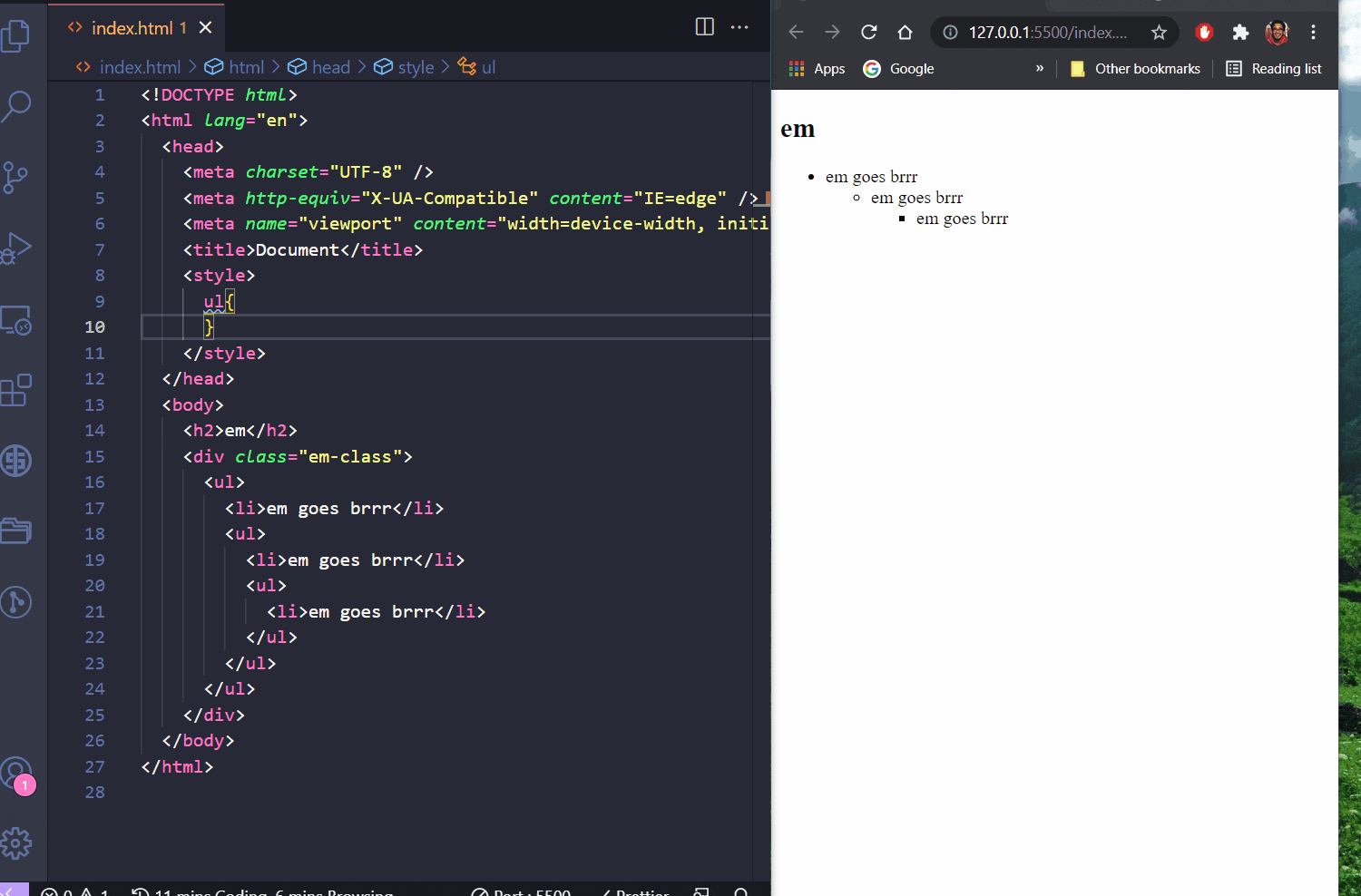
So while using em, we have to be a little careful.
Conclusion
Using relative units is excellent for making responsive websites, that focus on accessibility and provides the best user experience.
Special thanks to my friend Nitya Jagadam for helping me with edits.